One of the last projects I was involved in before I left the University of Bradford to join Black Marble was a new design for the external web site of the institution. I’d pretty much finished the construction of the page layouts and styles before I left, but it’s only now that the site is about to go live. I’ve threatened a few people with a series of posts on how the site is constructed and although I’m not there any more it seems topical.
In this post I’ll give some background, describe the project and run through why things were done in a certain way. Over the next few posts I’ll cover the construction in more detail - what styling problems I hit and how they were fixed, and how the site tries to make use of things like microformats and opensearch.
A Brand Refresh; A whole new look
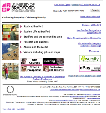
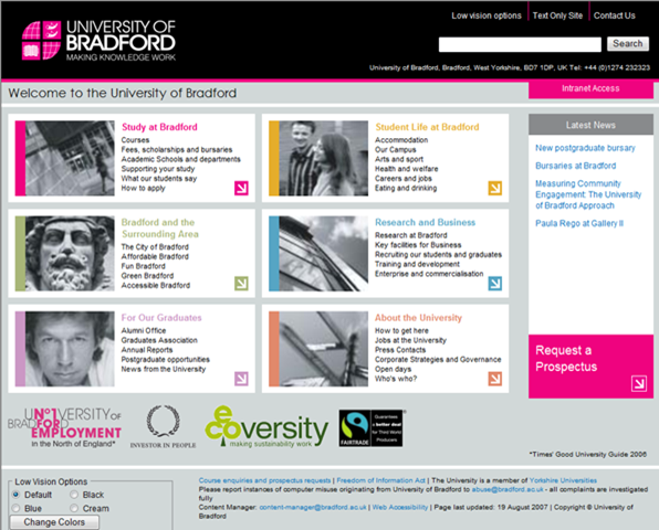
The University’s external web site hasn’t really changed much in years. Having said that, in spite of not necessarily being the snappiest dresser on the block, it was always extremely easy to find what you were after. Back in early 2006 the marketing department were engaged in a ‘brand refresh’ which to you and me means fiddling with the logo and corporate colours. Also to be included in the spruce-up was the web site.
For those of you who don’t know, my role at the University expanded to take in the web when one of my colleagues, who ran the web servers, left the organisation. I’ve always been passionate about web development (and I use that term advisedly) and I spent a fair amount of my time trying to expand the level of knowledge and appreciation of web standards, issues and technology throughout the university. It was because of this that I was asked if I could assist with the development of the new web site.
The design for the site was done by the same agency responsible for the brand refresh. It is extremely striking, and still in keeping with trying to make the site as navigable as possible. A meeting was had with the designer, the University’s Web Officer, the Head of Marketing and myself. In that meeting we agreed that the University would build the site itself from the designs created by the agency. This would allow us to make sure that we met our legal obligations in terms of Accessibility, and also ensure that the was knowledge and understanding within the organisation of how the site was built.
A series of laudable aims
It was agreed that the site should meet a series of requirements from a technical perspective:
- It should be a fully fluid design - not a thin sliver down the middle of your monitor but able to flow and take up as much space as allowed.
- It should work in all modern browsers, including mobile browsers such as Opera, and text-only browsers such as Lynx.
- It should be as accessible as possible, using accepted best-practice for ensuring users of assistive technologies would be able to get the most out of the site.
- It should attempt to include new technologies such as OpenSearch and Microformats if and where appropriate.
Assigning roles
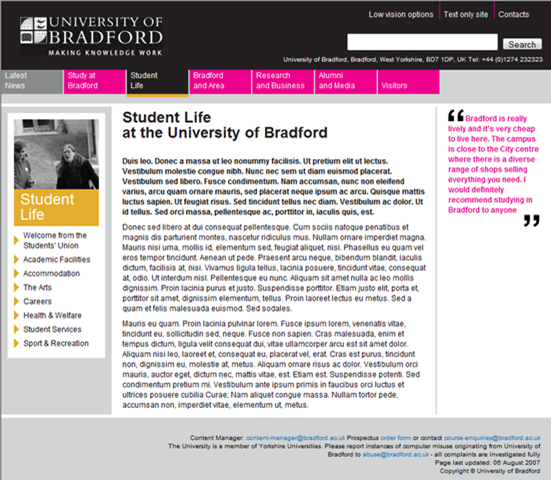
There were a number of areas that required work to make the new web site a reality. It was agreed that I would build the external homepage and a template for the content pages. I would not deal with site structure or content- those would be managed by the Web Officer and the marketing team.
Starting Out
I started out with a series of visual comps given to me in PDF format. I began with the homepage and started to work out how to tackle taking the design and building the underlying HTML structure.
I’m a bit of a luddite at heart, so I printed all the comps out at A3, got some large sheets of tracing paper and traced my initial wireframe, labelling the parts as I went.
Once I’d got a basic structure I then made some scribbled notes about how certain elements should function - using remote rollovers, for example.
After that, I pulled the comps up in my bitmap editor (Corel PhotoPaint, if you care) and took some dimensions to inform the initial styling, and lifted the colour values from the design element to feed into the stylesheets.
Once I had my trusty paper notes to work from, I started to tackle the creation of the site. I code by hand - I hate GUI editors - so I did most of the work in HTML-Kit from Chami.com. I now tend to use Expression Web, although I dip into Dreamweaver occasionally and I suspect that I will use Visual Studio 208 more as the projects I work on at Black Marble tend to involve ASP.Net coders as well.
In my next post I’ll run through how the homepage was built and what hurdles the web browsers threw into my path along the way!